Chapter 3. Personas
![]()
A summary representation of the system’s intended users, often described as real people. Any project can have one or more personas, each representing a different kind of audience for the system. Also known as: user profiles, user role definitions, audience profiles.
Personas describe a site’s target users, giving a clear picture of how they’re likely to use the web site, and what they’ll expect from it. Personas have become a popular way for design teams to capture information about customers that directly impact the design process: user goals, scenarios, tasks, and the like.
Figure 3.1. A pretty detailed persona.
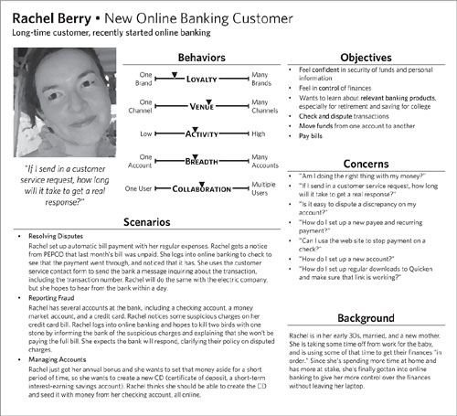
Good personas make everyone happy. They give design teams an effective, accessible way to describe user needs and stakeholders a common language for talking about their customers. Personas mean that no one on your team will have to say, “I think our users want this” or “If my mom were a customer she would want that.” If done well, they paint a multidimensional picture of the audience in terms that allow design teams to evaluate the effectiveness of their designs. Personas are also useful for getting stakeholders to agree on the composition of the target audience.
Personas aren’t born from nothing, sprouting like Aphrodite from the designer’s head. Instead, personas are typically the product of research into the target audience, and the complexity and level of detail depends on the available information. Research techniques vary from surveys and market research to interviews and ethnographic methods. There are shelves of books and articles on the best research techniques, but the purpose of this book is to describe the best approach for capturing and effectively communicating all that information.
There’s no standard format for personas across the industry, and different gurus have offered different approaches. Regardless of what approach you select, personas should have a couple of things in common: expressing what users need and what they expect.
Introducing Personas
Personas describe a fictional person who aggregates common aspects of a particular user group. The person is described in terms of typical behaviors, their objectives, and what they might expect from a product like the one you’re working on. These descriptions range from bullet lists to paragraphs of prose. Some designers will use diagrams to show ranges of needs or behaviors and where particular personas fall on those scales.
At their most detailed, personas paint richly detailed descriptions of a system’s users, creating a quasi-biographical portrait of a composite person, based on research data. Others simply offer a brief sketch of each type of user. Over the course of this chapter, we’ll discuss the merits of these various approaches, and how to tailor your personas to the needs of your particular project.
Personas have been a hot topic in the web design community since they were introduced several years ago. Whether or not you agree with the particular methodology and application of them or not, you certainly have gobs of examples online to draw from.
Personas represent distinct groups of people. How you come up with these groups is the topic of stacks of books on personas. In general, your process might fall into one of three categories:
• Data-driven: After deep analysis of the data, certain patterns emerged, driving you toward these particular groups. You can use the key data points to identify the persona.
• Institutional: These groups align to the way the organization typically talks about the target audience—just be sure to verify that they also work for your current purpose.
• Procedural: The persona roles are based on the customer lifecycle. You can develop personas that reflect the primary task in different stages of the lifecycle.
Challenges
Understanding users in the name of design is (I think it’s fair to say) fraught with controversy and obstacles. Preparing the summary of such work might seem straightforward, but it, too, comes with its share of difficulties. It’s easy enough to make people up, but summarizing what you actually know about your audience can be tough.
Figure 3.2. Todd Zaki Warfel’s persona format has been refined over the years. The combination of quantifiable dimensions with more humanizing descriptions yields an artifact that serves as a solid foundation for design. You can find the original templates here: http://zakiwarfel.com/archives/persona-templates/
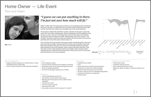
• Incomplete information: Personas summarize the target audience. Your understanding of that target audience can come from a variety of sources, but ultimately, you may not have access to the information you need to compose a persona. Addressing this challenge follows one of two strategies: seek out the information or use personas as an opportunity to highlight the lack of information.
• Legacy customer information: Another common pitfall in building personas is dealing with companies that have done business successfully for years without formal documentation of their customers. They may have informal ways of referring to different customer groups, which may not be relevant to your efforts. Part of the persona process is helping organizations learn a new way of talking about their customers.
• Actionability: Like any artifact not directly related to documenting the design, it can be challenging to ensure that personas are truly useful to the design process. They have the annoying habit of ending up on a shelf. If you’re creating personas to be a tool for the design team, they need to contribute to (if not drive) the design process. It can be challenging to zero in on a format that does this successfully. One way designers have adapted personas is to make them a little less backstory and a little more “behavior focused.” Reducing personas to their essentials gives designers the focus they need without losing any of the value.
Ultimately, personas are design tools—inspiration, reference, parameters, and constraints all rolled into one. Like any artifact, they are burdened with helping to move the design project along and getting the design team to communicate about the project. To many designers, however, personas are responsible for being the voice of the user throughout the design process. Herein lies the source of all these challenges: absent actual users of the system, the design team must be the voice of the user, and personas should serve as a constant reminder. There is no way for a single artifact to encompass the nuance of a persona, even in the specific context of design. People have a better chance. We may have them clearly pictured in our minds, but sometimes we need a document (like a persona) to keep us pointing in the right direction.
Anatomy of a Persona
The main choice you’ll be making as you construct your personas is how much information to include for each one. Generally, there are three layers of detail to consider. The most basic personas will only include the first layer, while the most elaborate will flesh out all three layers.
Table 3.1. The elements of a persona may be prioritized into three layers. You can get away with just using first-layer elements. Adding data points from other layers can create more robust personas but will require further information-gathering.
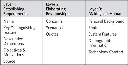
Layer 1: Establishing Requirements
Personas can be rich with data, but these elements are the foundation for the greatest practical applications. They establish and frame user requirements.
Name
Personas are summary representations of people. People have names. Therefore, your personas should have names, if for no other reason than to make it easy to talk about them with other project participants.
• Real names, like those you’d find in the White Pages, are useful because they create a vivid picture, something real for stakeholders to associate with their customers. Real names turn formerly abstract conversations into more concrete ones.
• A role- or purpose-driven name can keep project participants focused on the important issues—goals, motivations, needs. Either way, the name should be short and distinctive, even when describing the purpose: “The Learner,” “The Infrequent Customer,” “The Worrier,” “The Multiple Account Holder,” and “The Competitive Researcher,” for instance. These names describe what’s bringing these particular user types to the system in the first place by focusing on purpose and objective.
Real names and role names are not mutually exclusive. Feel free to use both.
You can name personas based on the process you used to create the personas:
• Data-driven: Use key data points in the name of the persona.
• Institutional: Use the same names used by the organization today.
• Procedural: Use names that reflect the primary task in different stages in the lifecycle.
Key distinguishing feature
What makes this user group different from the others? Summarize the persona in a sentence or two to help other people understand what makes them special.
In Figure 3.1, the distinguishing feature of the persona is that she is a recent convert to online banking, though she is otherwise familiar with the bank and its products.
Descriptive dimensions
Ultimately, you want to communicate what users know, what they might do, and what they want to achieve. Even when not using explicit personas, I still employ dimensions whenever I need to characterize users.
Dimensions are individual scales that represent a range of possibilities for a single aspect of a person. By using scales to describe user groups, you have a simple mechanism for comparing personas. You can also identify which areas of each dimension are NOT represented among the groups. Such dimensions might include:
• Knowledge: The user’s familiarity with particular aspects of the relevant domain.
• Tasks: The range of activities users choose to perform. The scale might reflect a quantity, or it might reflect two different extremes.
• Interests: The depth of focus users have on different aspects of the relevant domain.
• Characteristics: The degree to which users exhibit specific behaviors. Unlike tasks, these are passive, where people are not making conscious decisions or trying to accomplish something.
Not every dimension will be on a less/more scale. I created a persona for an online gaming site with “Platform” as a dimension. That is, a dimension that answered the question, “Where do people play the games?” Some personas were strictly online gamers. Others played on a variety of platforms.
Figure 3.3. Dimensions describing behaviors.
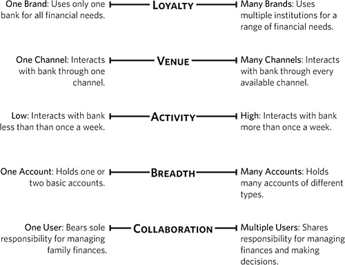
Objectives and motivations
The artifact should include a set of bullets listing the persona’s goals within the scope of the system. Typically, these goals may be expressed as what users want to get out of interacting with the system, but the goals may also reflect what users want from the organization, or what they want in general. For example, objectives for someone using a banking web site might be:
• Compare different types of mortgage products
• Apply for an account
Note the verb-object construction of these objectives. Like the descriptive dimensions, they express an action and the relevant information associated with the action. Such expressions are easy to parse relative to interactive systems, because they can directly translate to features.
Source
The best personas are born out of an intimate knowledge of the target audience, often through an ongoing user research program. Many teams, however, must create personas from a more limited set of inputs.
Treat your personas as individual research papers. Be sure to annotate (with footnotes, for example) citing the source of each data point, even if that source is an internal brainstorming session or the opinion of the CEO or VP of marketing.
Layer 2: Elaborating Relationships
With the basics in place, consider adding more information to elaborate on the relationships between the personas and the web site.
Concerns: What they care about
One way to clarify the relationship between users and the web site is to establish what concerns will influence their experience. Keep in mind that a customer’s experience extends beyond the web, or a single session of using the site. There are a few ways to express concerns, and they’re not mutually exclusive.
Features aren’t specific functions or types of content, but characteristics of the experience itself. Examples:
• Sensitivity to privacy
• Focus on task at hand
• Implication that trustworthy humans are “at the other end”
The persona can include questions from the user’s perspective, and reflect the kinds of things they’re thinking about before, during, or after using the web site. Examples:
• What’s the easiest way to get an update on my account information?
• I just refinanced my mortgage. How can I make sure I send the payments to the right place?
• How quickly do customer service representatives respond to email?
• If I do something online, will the people at my local branch know about it?
Within the context of the web site or the overall experience, a persona can characterize users’ typical pain points. These are the areas that tend to give people the most trouble. Perhaps they’re not equipped to deal with certain aspects of the experience or (more likely) the experience is not set up in a way to make things easy for them. You can express pain points as in these examples, and quotes are really useful for this:
• Importing account information from other institutions: “I know they’re not going to let me tie in information from my mortgage lender.”
• Knowing what to do in case of a potential dispute: “Ugh. Electric company is saying they didn’t get the check and I have no idea how to contact the bank to find out.”
• Understanding the disposition of a customer service email: “I sent them a message 3 days ago. Where the heck is it?”
Finally, genuine quotes from users allow the project team to raise issues they might otherwise avoid. Sometimes, a criticism or concern steps on too many egos, but deflecting the source minimizes the discomfort, and allows the team to have an honest conversation about it.
Scenarios and circumstances
Scenarios are more-or-less realistic scenes that set the stage for an interaction between a web site and a user. They allow project participants to picture the use of the system beyond the system itself, helping them understand how the system fits into their customers’ lives.
Scenarios also help project participants identify what information users might have in-hand when they approach the site. For example, a user checking on flight status information should have the flight number, but may not in every scenario. They help the project team understand the range of decisions someone needs to make and the kinds of outputs they’re expecting.
A part of the design process frequently neglected is how people use the information they get out of a system. From the system’s point of view, it’s “spit out some bit of information and the process is complete.” But this is rarely the case for the person using the system. The information is a trigger for making a decision—“the flight is delayed, so I might miss my connection” or “my package still hasn’t shipped, so I’d better call customer service.”
A simple scenario consists of at least five parts:
• Context: The starting point for the scenario, identifying the user’s location or situation leading up to the scenario
• Trigger: The event that caused the scenario
• Action: What the user did to address the scenario
• Inputs: What information the user must have to address the scenario
• Expectations: How the situation should change to meet the needs of the user
Scenarios can represent extreme circumstances:
Melissa is out shopping when her credit card is declined. Upon returning home, she visits the customer service URL on the back of the credit card to determine why the card was declined. Melissa expects to see instructions on how to access her account and from there how to determine why the card was declined.
Scenarios can represent circumstances unique to particular users:
Nathan is a small-business owner looking to set up payroll through the same bank that has his business checking and savings accounts. He emails his small business contact at the bank to inquire about payroll and hopes to get some quick instructions on setting it up.
Finally, a scenario can represent a typical circumstance within the context of a specific user group:
Sarah is a new college student and is getting a checking account for the first time. She knows her Social Security number, but has no other information. She’s expecting to go to the bank tomorrow to tell them what kind of checking account she wants to open.
Remember: A persona will likely include more than one scenario.
Quotes
Using quotes from users adds a personal touch without the distraction that comes with additional layers of personal detail. A good quote can be very evocative of how a user perceives his or her relationship to the web site. You can use actual quotes from your research participants to remind stakeholders that this information has a foundation in research.
Examples:
• “I don’t mind researching banking stuff online, but I’d rather do all the transactions in person.”
• “These days picking a checking account is like trying to pick a toothpaste. Have you seen the shelves of toothpaste in the grocery store?”
Layer 3: Making ’em Human
The first two layers contain all the essentials and more for describing users, but you may find the following data points useful for creating a real picture of your target audiences. These can make personas an easier pill to swallow for team members who haven’t worked with them before.
Personal background
Personal background information can flesh out the user and make the persona more accessible to stakeholders and designers. Such information can include “day in the life of” descriptions or an overall relationship to the task at hand. In the case of our college student, for example, Sarah’s personal background may indicate that she’s never been good at managing money and her parents did not prepare her well for dealing with budgets and bills.
The personal background information is an opportunity to tell a story about the user, but it transforms the persona from a summary set of needs to a real—albeit fictional—person. On the other hand, too much information can be distracting.
Photograph
The cherry on the persona sundae is a photograph. Like personal background, a photograph can help stakeholders stop thinking about their customers as a singular anonymous mass and understand that they are people with particular needs. As a practical matter, a photo can represent the persona, an easy way to bring the persona to mind.
On the other hand, photographs often come with risks. Using photos of actual users taken during research activities, for example, may present legal problems. Be sure to secure permission from research participants before using their pictures in any materials. Of course, there are plenty of stock photography sites that can provide good images for this purpose. A Google Images search on “headshot” presents an abundance of material.
System features
System features spell out the site’s content as it applies to the motivations of your personas. You may already have a sense of the features and content the site will include. In this case, you can align these elements with the persona’s motivations to show which features will help users meet their needs.
Often, this process makes it much easier to spot the features that do not support any user needs, which will help the design team justify removing these features from the system.
By the same token, laying out the system features in this way will help designers see if some motivations do not have any features to support them. Stakeholders then learn where they should invest resources to ensure that their customers are getting everything they need.
Demographic information
A holdover from its predecessor, the marketing segment, demographic information is meant to describe the whole category of user, detailing, for example, the range of ages each persona might include.
By including demographic information in the persona, however, you are mixing genres. The persona is meant to be a summary representation of a group of users—a description of a single user (whether concrete or abstract) that best represents a set of needs. A persona should be described as a “35-year-old woman,” for example, rather than as a “female, between the ages of 35 and 50.” The purpose of a persona is not to describe the tendencies of a group of people defined by age, sex, race, and income, but instead to describe the behaviors of a specific person who represents a class of needs and goals.
Tip: Existing Labels
An organization may have an existing vocabulary to talk about their users. Typically, these labels are derived from market research and have limited value as a design tool because they don’t distinguish people by behaviors or tasks. You can still reference these labels to help stakeholders understand how personas relate to the audience as they understand it.
Technology comfort level
This bit of information is a favorite among first-time persona builders, but the real value of this information is its implications. A user’s comfort level with technology should be translated into actual needs. Knowing that some people have never used the web to shop before, for example, does not necessarily help the design team. On the other hand, knowing that a particular user group will still seek contact with a human because they do not feel confident in giving certain information online does have a direct impact on the design.
Creating Personas
The hard part for personas is figuring out how to format the information (of which there is always too much or too little) in a way that’s most useful to the design team.
Basic Decisions for Personas
Creating personas, like any project, can spin out of control if not appropriately constrained. Understanding where, when, and how you’ll use the personas (as well as who is going to use them) can help keep the endeavor focused.
Purpose: The role of personas
Whether you’ve already conducted user research, are just about to, or can only rely on existing institutional knowledge, establish a reason for creating personas. From an information-gathering perspective, this will help focus your efforts, but it will also drive what to include and what to leave out in the personas themselves. There are three reasons for creating personas:
• Framing requirements: If you’re presented with a stack of requirements written in jargon and from the system’s perspective, reframing those requirements from the user’s perspective can help. The source of those requirements may be user research (translated into insights for design), but ultimately you’re still establishing a framework for the design activities.
• Validating design: Instead of driving design, you might build personas as a tool to help validate your design decisions. In this case, the personas need to help you answer the question, “Does the design successfully meet the needs of this user?”
• Hypothesizing research: In recent user research projects, I have created personas as a starting point that gives the team something to talk about and provides a basis for testing. Generating a set of personas through internal brainstorming yields a set of questions about our target audience—perfect for establishing a research agenda. In conducting subsequent research, we gather data to validate the model.
Timeline: When personas happen
Ideally, personas come at the beginning of a project. They can supplement other documents that establish project requirements or—in a pinch—stand on their own.
Most of the user research projects I’ve been involved with culminate in a set of personas. While we have a general understanding of the products they’ll be applied to, we’re not necessarily teeing-up a specific design project. So, there are two circumstances in which you’ll create personas:
• Stand-alone project: As a separate project, you’ve got dedicated funding and perhaps a longer timeline in which to create personas. The challenge is that you may be creating personas outside the context of a specific design problem because they will be a tool for use in multiple future design endeavors.
• Precursor to design project: Incorporation into a specific design project creates some constraints both positive and negative. While a limited budget may prevent analysis paralysis, it can also force you to compromise the development of the personas. On the other hand, creating personas with a design challenge clearly stated can yield a more targeted result.
At the beginning of a project, you may find yourself in one of two different situations:
• Existing web site: In the more typical situation, you already have a list of the kinds of content and functions available in the system. This list exists because you’re redesigning an existing system or the stakeholders have a wish list of features. In this case, including these features in your personas will help put them in context.
• New web site: In the less typical situation, you are creating a new system from scratch and have only preliminary ideas about what kinds of features to include. This situation impacts persona design because you can only summarize what you learned in research: what motivates the users in different scenarios.
Audience: Who’s looking at the personas
With an understanding of the position in the project, consider who will be using the personas. Personas capture a particular breed of requirements, and every project participant needs to make sure his or her work addresses those requirements. For that reason, the format for personas need not vary by audience. Still, some areas of the personas will be more useful to some project participants than others.
Tips for Polished Personas
You could hand in a short stack of pages that represent your target audience and be done with it. But your research no doubt includes some extra details you’d like to share. Or perhaps you’ve done some analysis on how these target audiences relate to the business overall, or to each other. By bookending the personas with a little extra detail, you create a self-contained package of essential information.
Create a summary of the personas
Because personas can represent a significant departure from the institutional conception of the target audience, stakeholders may be caught off guard by diving into the details of the first persona right away. To ease them in, you can use an overview that describes the personas at a high level.
Figure 3.4. A one-page summary of personas can help give people a sense of the range of users in the target audience. This is also a nice device for kicking off a presentation on user needs.
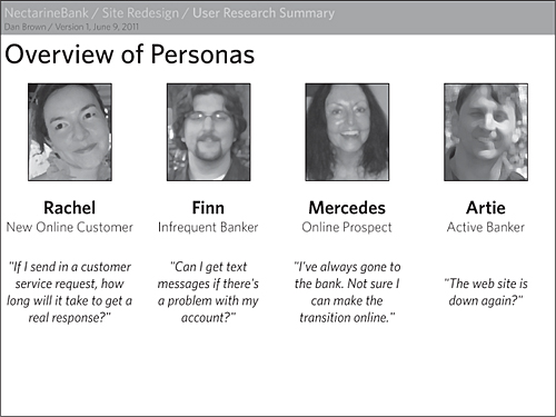
Some elements you might include on this summary page:
• Name and role
• Picture
• Sensitizing quote
• Highest priority (what is the user’s chief concern or need, or most important tasks)
• Reference to internal segmentation label (to help stakeholders cross-reference with existing vocabulary)
One of the following suggestions may yield a diagram that can be useful for the summary page.
Illustrate relationships between personas
Depending on your segmentation model, the personas may have relationships to each other that are worth describing to your stakeholders:
• Progressive relationships: Some sites expect a natural progression of users from new customers to seasoned customers and will treat each stage of growth differently. You can incorporate these relationships into the personas themselves, or on a summary page.
Figure 3.5. Showing users’ transition from one persona to another can help clarify the varying relationships someone might have to the web site.

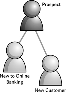
• Hierarchical relationships: In your set of personas, some personas may be “parents” of others. For example, the New Customers group may include two subgroups: First-Time Customers and Customers New to Online Banking. Showing these relationships can be useful if, for example, most of the users have the same set of needs but there are dramatically different scenarios drawing two groups of users to the site.
Figure 3.6. A more elaborate timeline can show how users’ interactions with the web site change over the course of a lifecycle. Courtesy of Will Evans (http://semanticfoundry.com). Shown with the version created for EightShapes Unify, deliverable templates produced by my firm. Learn more at http://unify.eightshapes.com.
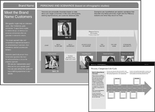
Because personas can be so new for your stakeholders, though, persona relationships may be more trouble than they’re worth. If your stakeholders are already skeptical about personas, adding detail and data to the mix will not help them answer the question “So what?”
Facilitate comparisons between personas
Perhaps what matters more than how the personas are derived from each other is how they are different from each other. Highlighting similarities and differences can help establish a prioritization for requirements.
Show contrasts in needs, concerns, or tasks: Regardless of how you represent needs or concerns—a list of functional requirements, system features, or more abstract design principles—they can serve as a basis for comparing personas.
You can compare personas using tables that show which personas have which needs. Figure 3.7 is a table with simple yes/no checkmarks to indicate whether a persona has a particular need or not.
Figure 3.7. A simple needs comparison indicates only whether a particular persona has a need or does not.

Figure 3.8. Hierarchical relationships between personas may be shown by physically linking persona icons together.
If your personas represent a more nuanced range, or you are comparing across design principles, your table can show those nuances. Figure 3.9 is a table using a device to indicate the relative level or importance of a task for each persona.
Figure 3.9. Comparing design principles across personas, this table uses circles with shaded pie pieces to indicate where the priorities are. By the way, those quarter, half, three-quarter, and full circles are called Harvey Balls. I’m not making that up.

Tables highlighting similarities and differences are ripe for showing additional data points, using other symbols or changes in color or value:
• Availability of content or feature: You can show whether the site already has the information or functionality to support the persona’s need. Perhaps the organization can’t support the need at all. Alternatively, a particular need may be common to two personas, but the organization may be able to support the need for only one of the user types.
• Opportunity for user research: If you don’t know whether a user group exhibits a particular trait, you can highlight this in the table as a “best guess” with room for further research.
• Elevate two dimensions: Using a 2x2, you can show how personas compare across two dimensions. Picking the right dimensions is key, and you should focus on those that.
• Have a true range: The dimensions should have a range of values, not just yes or no. For example, “frequency of usage” is a good dimension because you can imagine something between “all the time” and “not at all.” On the other hand, a dimension like “user type” with “home” at one end and “business” at the other doesn’t imply any intermediate values.
• Are independent of each other: Dimensions that are dependent won’t show any more than two user groups. In other words, if every user ends up in one of two diagonally opposite quadrants, they really only vary along one dimension. For example, with the dimensions “how much does the user pay attention to finances” and “complexity of interactions,” you might realize that people who don’t pay a lot of attention to their finances don’t use complex interactions in online banking. In this case, users really only fall at two ends of a scale.
• Are meaningful to designers: Finally, the dimensions must have some meaning to the designer, the person who will be using this information to construct an experience. The venue for doing banking (online, ATM, phone, teller) may be interesting, but for the designer of the online banking experience, not highly relevant.
Figure 3.10. Using dependent dimensions, personas only end up in two quadrants, indicating that the variety among personas is limited to one dimension or that you need to find another way to compare them.
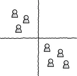
Figure 3.11. Using a 2x2 to compare personas can highlight major differences between them along key dimensions. This visualization won’t dig into the subtleties, but it can help clients see what the major concerns are among their target audience.
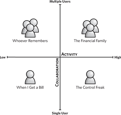
With such a comparison, you paint the personas with broader brush strokes. Unlike the comparison tables in Figures 3.7 and 3.9, a 2x2 lacks the detailed inventory of priorities. The value, however, is showing stakeholders and designers what makes users different on a more fundamental level.
Show mental models
A mental model is one of two things:
• More generally, a mental model refers to a user’s conception of the domain, usually related to content and structure. You might say, “A user’s mental model of online banking centers around the concept of an account.” You can use a concept model for this (chapter 4) and embed it right in a persona.
• More recently, mental model refers to a specific diagram created by Indi Young in her book Mental Models: Aligning Design Strategy with Human Behavior. With this technique, you compare user tasks, activities, and expectations with content, functionality, and other features of the site.
Figure 3.12. Mental models align user needs with content and features. User needs go above the line, divided up by tasks. Content and features from the site appear below the line, aligned with the needs they support.
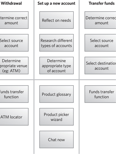
One objective of user-centered design is to align the design of a system with the user’s mental model. Regardless of how you illustrate them, incorporating the user’s mental model into personas can be a powerful way to focus designers on what really matters.
Level Up Your Persona Skills
Personas are pretend people that can really spark the imagination. While this can yield useful insights as you study data from user research and other inputs, it can also be a dangerous rabbit hole. Concocting novellas about your users can be fun, but it usually diminishes the purpose of personas: to be a useful design tool. Here are some things you can do to avoid slipping into Wonderland.
Incorporate actionable information
The value of personas is measured only by how useful they are during the design process. It’s easy for the enthusiasm of project teams to wane as they enter the throes of wireframe revisions and prototyping. The importance of understanding your users, however, never diminishes and a misunderstanding can rear its head when you least expect it.
For design decisions that arise in the eleventh hour of the design phase, personas come in handy because they guide these decisions, avoiding the kind of completely random, bleary-eyed shots in the dark so frequently associated with these moments.
For these reasons, it’s important not to forget about personas once user research is complete (which is, alas, all too easy). To avoid relegating personas to a dreary life on the shelf, there are a few things you can do:
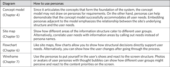
• Make cameos in other deliverables: By incorporating the personas into subsequent deliverables, for example, you show how they support design decisions down the road. You might incorporate them into a site map, for instance, to show how certain categories were escalated to meet the needs of particular user groups. For wireframes, you might include the headshot of the persona representing a particular segment and suggest how a person from this segment might react to the wireframe.
• Create posters: One trick some user experience professionals use is to print the personas on large posters and tack them up around the office. (This would have been inappropriate during the author’s tenure at the United States Postal Service, where the only people tacked up on post office walls were wanted in several states for larceny and fraud.) If this is what it takes to keep users top-of-mind for your project team, suck up the Kinko’s printing costs and break out the thumbtacks.
Designing a poster is very different from designing a research report. Even if you create one-page cubicle hangings on standard office paper, you’ll want to design them so people can glean the key points at a glance.
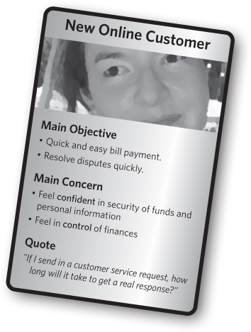
• Create trading cards: Alternatively (though perhaps no less expensive than printing posters) is creating a set of trading cards that represent user personas. Like posters, the format of trading cards forces you to boil a persona down to essentials. Print up a pack for every member on the team and make sure they bring them to brainstorming meetings.
Figure 3.13. A persona trading card can be a useful tool in brainstorming meetings (each participant gets a card) while still appropriate to hang up in a cubicle.
Reference your sources
Although this is really a methodological risk, it deserves some discussion, because you can’t make a persona without something to base it on. Sourced deliverables hold more weight, and team members generally appreciate the personas more if they understand where they came from.
Represent reality accurately
Though it’s tough to admit, it’s possible that our personas do not accurately reflect the customers. This could be a methodological issue—like the one earlier where there wasn’t enough data to construct a complete picture—or a documentation issue, where the way you’ve chosen to display the results from the research does not accurately capture the users.
From a documentation perspective, you can lose sight of reality through too much abstraction: taking the results of user research and smoothing them over so much as to lose the nuances of user behaviors, objectives, and needs. It was this concern that led me to stop creating personas as groups of people, and focus more on ranges of behaviors—a trend I have observed throughout the industry. By starting with the names of personas, your inclination is to match findings with those invented roles, instead of letting the data speak for itself.
Keep personas lean
Background stories, photos, and real names are nice, but they can distract from the purpose of the personas. Stakeholders may focus instead on these details, which don’t speak to need or motivation and which ultimately do not provide any relevant information to the project team. Keep an eye on the time as you flesh out the demographic details of your users and decide how much you want to spend on this part of the persona.
Presenting Personas
Personas are people—abstract summaries of people, but people nonetheless. You are hosting a party. These people are guests. Introduce them. Remind your guests of honor (the stakeholders) how they might know them and what they have in common—perhaps even why they invited them in the first place.
The users of the system will have goals that support the goals of the stakeholders. As host, your job is to show them how these apparently divergent interests have something in common.
Establish a purpose for meeting
The primary reason I discuss personas with the project team is for clarification. When we’ve got a “complete” persona in front of us, it’s still only a partial picture, and the project team probably has a lot of questions.
As a tool in the design process, personas may not have conversations dedicated to them, but they may play a role in subsequent design reviews. In this case, the purpose is not to discuss the personas themselves, but instead to talk about the design in the context of the personas.
Finally, you might need to discuss personas even before you’ve had a chance to make them because you need to “sell the idea” to your project team. If, historically, they haven’t worked with personas or user research before, you might need to convince them it’s a good idea.
Discussions to clarify personas
In this type of meeting, your team members and stakeholders are there to ask questions and provide input on the personas. This meeting occurs after you’ve created a draft of the personas. There are three main topics when clarifying personas:
• Clarification of institutional knowledge: Prior research or insight about users may feed persona creation. If this is the case, the people inside the organization are, for better or worse, the experts on users. In a feedback meeting, you’re validating that you’ve captured the institutional knowledge adequately. If you’re advocating for additional user research, these meetings might also highlight gaps in the institutional knowledge.
• Interpretation of research: Feedback on the content of the persona itself may be inappropriate if the stakeholders or other team members did not participate in the research. You may have to push back on suggestions to change the personas when the suggestions have no basis in the research you did. The team members may, however, offer different interpretations of the data, which could call your conclusions into question.
• Prioritization: User research can give you insights on what the target audience needs, but only the business can prioritize those needs relative to their operation. Just because something is important to users doesn’t mean it’s necessarily important to business. Successful products find themselves mediating this tension. That said, as you work with stakeholders to prioritize personas and their associated needs, your role is to be an advocate for users, ensuring that their needs are not lost in the effort to limit project scope.
Because user research or information-gathering methods may be (or appear to be) subjective, these meetings can be controversial. Participants may wonder why their particular interpretation of users is “incorrect.” To help position the conversation and personas appropriately, your meeting should incorporate these messages:
• Personas should include information to drive design: It can be tempting to “gold plate” personas with all kinds of embellishments. As facilitator, your job is to keep the conversation on track. An occasional diversion into the culinary preferences of a particular audience segment might be fun, but ultimately you’re building a tool for doing design.
• Agreement is paramount: Since personas form a foundation for understanding users and driving design, it’s crucial for the design team to internalize this knowledge of the users. If they don’t agree with it, they won’t internalize it. Your methods may vary, but I recommend leaving information out if people on the team don’t agree with it. At the very least, we leave it as an open question. What good is a constraint or a requirement if you don’t know it to be true?
Personas in design reviews
If they’re useful, personas will appear throughout the design process to keep efforts focused and on track. In design review meetings, the project team walks through the latest incarnation of the design. During these conversations, you can use personas to smack down scope creep or justify a design decision. The section “Using and Applying Personas” later talks about how to incorporate them into design documents themselves, but you can reference them even if they’re not explicitly represented in subsequent deliverables.
Some key messages when bringing up personas in a design review:
• Primary user requirements: The personas erected a set of requirements that helped drive the design. Remind stakeholders of what main requirements came out of the personas and how those drove the big ideas of the design. Walking through a design means showing how themes resonate throughout the design, and personas can frame those themes.
• Criteria for design decisions: It may be challenging to draw anything beyond a broad stroke between personas and the design, but occasionally there is a clear connection between a portion of the design and the personas that inspired it. Be sure to point out these specific connections.
• What’s changed: Subsequent user testing or user research may have moved the needle on the personas. If they need to be updated based on new information, be sure to acknowledge the change, but don’t get distracted from the design review.
Selling personas
Getting project stakeholders to commit to creating personas is no easy task if they’re not convinced of their value. A big part of selling an idea is making the idea palatable, which might mean adjusting your methods to fit the project into parameters established by the stakeholders. When discussing the potential of a persona project, I focus on these messages:
• User needs drive design: In the inaugural issue of Want Magazine(wantmag.com) Peter Merholz, president of Adaptive Path, said in an interview, “The thing we can’t manufacture is needs.” As designers, we can’t tell people what they need. You must help stakeholders understand that design can’t happen in a vacuum, and that great design happens in the context of well-defined constraints. The ideal constraints are an understanding of user needs.
• We need more detail about users: Organizations with existing conceptions of their target audience tend to paint them with broad brushstrokes. They describe them in terms of demographic groups when what is needed are descriptions in terms of behaviors.
• We don’t see the information we need: Existing research usually includes reports on focus groups or surveys, and the questions are generally not directed at how people will use the web site or product. Typical market research seeks to understand what users want, not how they behave.
• We don’t research for research’s sake: Conducting user research and preparing personas should be in the service of a design project. It’s difficult to establish meaningful objectives for personas if they will exist outside the context of a specific product or web site.
• A bare minimum: Stakeholders unconvinced of the process may yet allow a bare minimum. For my projects, I try to arrange an interview or two with someone who the team identifies as the best proxy for the user, like a customer service representative or someone responsible for conducting market research. In this conversation, venture this as a possibility and show an example of the kind of output you expect.
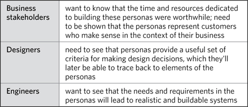
In a buy-in meeting, different participants will look for different things.
Table 3.2. Getting buy-in from different team members means reassuring them in different ways about the value of personas.
Adapt the basic meeting structure
A conversation surrounding personas can still follow the basic structure established in the Introduction.
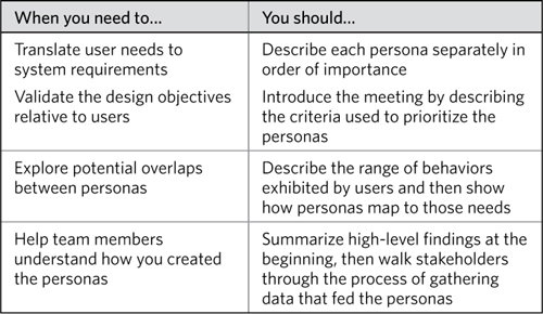
You might discuss the personas in order of priority—in other words, by order of their importance, their value, or risk to the company. Or you might choose something like a “family resemblance” presentation, where personas are discussed in related groups. Finally, some people will describe the steps taken in creating their personas, in a chronological account of how they came to be. Table 3.3 provides some suggestions for how to determine the right order.
Table 3.3. Present personas in order, but the order is up to you.
1. Establish context
Kick off a persona meeting by explaining what role personas play in the design process. Even if you have two or three conversations to talk about the results of the user research or analysis, reminding participants what drove the endeavor in the first place helps solidify the context.
Then, describe the sources of information that fed the persona creation:
• For primary research, sketch out the methods and techniques, the number of users you engaged, and where you are in the analysis.
• For informal research, spell out what activities you have been able to accomplish and what constraints are keeping you from more extensive user research.
• For secondary research or interviewing user proxies, inventory the sources you read or the people inside the organization you spoke to.
2. Describe visual conventions
While a persona may not have the visual complexity or nuance of other diagrams, you should still provide a tour of a typical persona, pointing out the major areas of information. If you use visualizations in the persona to identify aspects of their behaviors, be sure to explain these, too.
3. Highlight major design decisions
A persona may not have “design decisions,” per se, but the parallel here is the overall segmentation model. Take a moment to answer the question, “Why did you divide up the personas in this way?” Recall that there are three main ways for roles to emerge (data-driven, institutional, procedural) so you might use one of these concepts to drive the discussion.
During this part of the conversation, you can also introduce any summary diagrams that describe the relationships between the personas.
4. Offer rationale and identify constraints
If necessary, you can elaborate on the research methodology used to drive persona design. While research techniques can provide a rationale for the personas, be careful:
• Don’t spend too much time on methodology: While you may be proud of the research plan and execution, the team needs you to cut to the chase (whether they realize it or not). A description of research methodology isn’t to set up to the personas as a punch line. It’s inserted in the discussion to help participants frame the result.
• You may have to justify the justification: Describing any form of research opens itself up to methodological attacks. Sometimes, project participants think that just because it’s called “research” you’ll have the time and resources to control every variable.
• Acknowledge that user research is an imperfect science: I almost always indicate that research is a design tool, and that its primary purpose is to help me, the designer, get into the shoes of users. I don’t need to know every detail about their lives, and sometimes a good quote is all it takes to trigger an understanding of their position.
5. Point out details
You didn’t spend too much time on 1 through 4, did you? Good because, this is where you dig into the personas themselves. The next section “How to Describe a Persona” talks about narrating a persona description in great detail. The challenge here is finding a way to discuss all of them in the space of 30 minutes. There are two approaches to structuring this section:
• Priority order: Articulate your criteria for prioritizing the personas. Start with the most important and work your way through each of them, spending less and less time. Perhaps use the “soliciting feedback” portion of the meeting (step 7) to get input on the priority. This approach is ideal when you have more than four personas and they’re unrelated.
• Family resemblance: Instead of presenting each persona separately, you can drive the discussion around the characteristics used to describe the personas. Identify all the attributes up front and then describe how each persona stacks up against each one. You can then do deep-dives on personas that best illustrate each “family.”
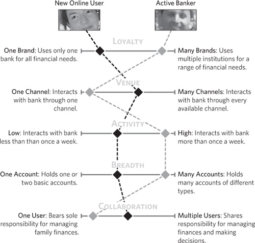
If your persona effort yielded a behavior model, not a set of individual personas, you can instead describe each dimension, its extremes, and where most users in your research fell along the dimension.
Figure 3.14. Linking dimensions together, you can show how one user group maps to each of the behaviors in the model.
6. Communicate implications
It’s time for the rubber to meet the road. The personas yielded insights about how to design the product. During this portion of the meeting, describe the main conclusions that will be driving the design. You might identify:
• Common requirements or design principles: Collectively, the analysis of user needs will yield a set of basic requirements for the design exercise. These can be broad or narrow. Broad: “Users are generally coming to the site to accomplish two primary tasks.” Narrow: “Make sure to highlight three primary benefits at the top of each product page.”
• Challenges from conflicts: Any group of personas will likely yield a set of requirements that may have some inherent conflicts. One persona may prioritize one thing that another deprioritizes, for example. If your analysis has zeroed in on these conflicts, you can point them out and highlight the challenges facing the design process.
• Unrealized opportunities: Analysis on the personas may yield insights into the product design that the stakeholders had not anticipated. In short, you might get some ideas for the products.
7. Solicit feedback
As with any conversation about a design artifact, discussing personas means getting good feedback from the project participants. Establish a scope (what it is you need feedback on) and the kind of feedback you need. For personas, scope can include:
• Segmentation model: You might ask, “Based on what you’ve heard, how would you cut up the audience differently?”
• Prioritization: “I’ve listed these personas in order of importance based on how closely their needs align with the business objectives. Would you prioritize them differently?”
• Behavioral dimensions: “In our analysis, we focused on three key behaviors or attributes–loyalty, focus, and collaboration. Are there other behaviors you think are important?”
• Descriptive elements: Position feedback on personal attributes in terms of their impact on the design process. “I know the picture and biographical information is to help the persona come alive, but clarifying those aspects might help design activities.”
8. Provide a framework for review
To make the meeting actionable, establish specific questions you still need feedback on. If you couldn’t get to all the topics in the soliciting feedback step, it’s worth articulating those in the meeting minutes as outstanding items.
To provide a more concrete framework for review, you can leave meeting participants with a homework assignment, answering two questions:
• If you could ask our users anything, what would you ask them? Questions produced in response will help you determine if the personas can paint a clear picture of the users in the heads of team members.
• What is the single biggest design challenge you face? Responses to this question will help you determine if the personas can provide direction for this challenge.
(Yes, you should ask these questions before endeavoring to create the personas, as they will help guide the research.)
How to Describe a Persona
Regardless of how you structure the meeting, at some point you’ll need to describe a persona. The manner in which you describe a persona to someone on the team is going to vary by the nature of the personas themselves. Fully fleshed personas can be treated as characters with elaborate backstories, while role-based personas won’t lend themselves to simple narratives.
Personas as people
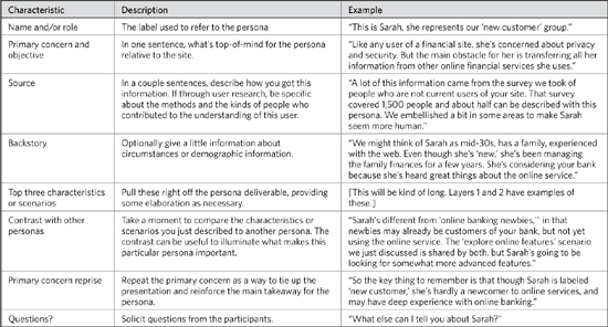
Table 3.4 presents a simple pattern for describing a persona.
Table 3.4. Personas as people.
Personas as characteristics
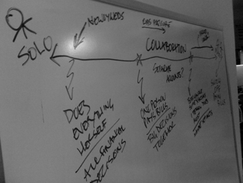
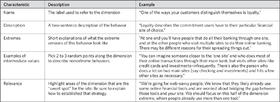
With a more modern approach to personas, where user requirements have not been anthropomorphized to the same extent, the structure of your presentation needs to change. Instead of walking through each persona individually, you will present the range of behaviors or other characteristics that define the target audience. Recall that in this approach, you’ve identified half a dozen or so characteristics and represent them as ranges. Table 3.5 presents a pattern for describing each dimension.
This framework also works when you’re using the “family resemblance” meeting structure. Instead of describing extremes or intermediate values, you can indicate what different intensities refer to. In other words, if you’re mapping personas against a set of dimensions with a “moon phase” chart, you’ll need to describe what someone with a quarter circle is relative to someone with a full circle.
Figure 3.15. By whiteboarding a characteristic you can embellish your explanation with emphasis on the extremes and intermediate values. It offers ample opportunity to show examples.
Tip: Separate Design Implications
It can be easy to slip from persona description to design implication. (“New customers find feature X important, so we want to prioritize it on the home page.”) Though it’s perhaps best to separate persona descriptions from design discussions, if you find it unavoidable, make sure you clearly delineate the two. You can demarcate design statements explicitly so as to avoid making promises that down the road prove to be poor design decisions. At the same time, you can translate the desire into a meaningful requirement: “Feature X is a high priority item and we should reveal it prominently on the site.”
Table 3.5. Personas as characteristics.
Avoid newbie mistakes
It’s just as hard to mitigate the following risks as it is to recognize that they’re happening. Generally speaking, make sure you know what you want to get out of a presentation and be cognizant of the things that will prevent you from achieving those goals. This section describes some common meeting pitfalls.
Personas impact design
We’ve all been here: You’re walking through your personas and your audience is not engaged. They ask no questions and provide no feedback. When faced with this risk, you must:
• Make it clear what the potential impact of personas is not only on the final product, but in their work on the project downstream.
• Offer examples of the kinds of design decisions you might make based on the personas, especially where the lack of personas will make deciding upon a direction more challenging.
• Show the people involved how user needs translate into real design decisions. Also useful is to have some counterexamples in your back pocket. Show how a lack of user direction made your favorite bad web sites the way they are.
Personas are design tools
Like the team assigned to create the personas, the people reviewing the personas may likewise become absorbed with the details behind the fiction, such as a photo or a user narrative. By spending too much time on age/race/sex/home-life conversations, you miss the notion that this person can be anybody, and that what makes them relevant in the context of your system is how they’re going to use the outputs and what they will put into it.
In this situation, you can use a tangent to springboard into a more relevant scenario. You can redirect the conversation, attempting to “zoom out” of the irrelevant detail to show what the larger impact might be. Sometimes, I let these conversations peter out, to let the participants get it out of their system. This is a good “teachable moment” to help stakeholders understand what the focus of persona development should be: a design tool.
Make use of research
The purpose of a persona is to avoid conversations that begin “I think the users want…” or worse, “What I would want to see….” One way to avoid this is to distribute copies of the research results before the meeting. This allows you to point to them and remind participants that the personas are a friendly way of summarizing data from your research. While personas discussions shouldn’t be overwhelmed by in-depth methodological descriptions or explanations of your analytic process, you can use an overview of the research technique and results to kick off the conversation.
Anticipate methodological criticisms
This book isn’t about method and technique in conducting user research, but well-formatted personas can trigger such questions because they paint a vivid picture of the target audience. Disagree even slightly with a stakeholder on the nature of that target audience, and the first thing they’ll do is question the methodology. Even when they have no particular beef with your findings, if some stakeholders haven’t been along for the ride, they may question the validity of your approach. Though frustrating, these are important questions. If you can address them successfully, the personas will be more legitimate.
As with any meeting where you expect a challenge, the best thing you can do is anticipate the range of critiques you might get and prepare a response. Some typical critiques:
• Number of users
• Kinds of users studied
• Recruiting
• Lack of research
• Data-gathering technique
Facilitate corporate culture change
Stakeholders may gravitate toward talking about the users with the old mindset, with an institutionalized way of segmenting them that is irrelevant for designing the web site (for example, distinguishing international and domestic customers). To mitigate this risk you can:
• Remind stakeholders that for the purposes of this conversation, personas are the preferred means for talking about users.
• Indicate that the value of personas is that they represent user requirements as a set of needs that impacts the system design. Indicate that your intent is not to invalidate the old segmentation model, which might be useful for other activities in the organization.
• Provide readily accessible translations from old model to new by referencing common labels for the segments in the new model.
Using and Applying Personas
Personas are a great way to capture user needs, but they cannot stand on their own. Ideally, your personas must fit into the overall design process.
Personas provide a means for:
• Prioritization: Which features and content are most important
• Validation: Whether to include a feature
• Completeness: Whether anything is missing
Personas are both abstractions and summaries. They don’t address every nuance of every user group or every system requirement. They depend on a segmentation model, a way of grouping customers that can also bias those user needs. Done correctly, personas should give the team a language for talking about users that focuses on actual user needs. They should also provide a structure for capturing requirements and for involving users throughout the design process.
Personas and Design Documents
Personas are a great way to interject rationale into the design decisions captured in these documents, just as they are with strategy documents. With a persona, you have a set of requirements embodied in a single label, like Amanda or New Employee. If you’ve used personas throughout the life of a project, you can utter these names to any member of the team and instantly call up a set of needs and scenarios without having to describe them one by one.
In each of these deliverables, you can use persona names to show how particular design decisions support particular user needs. Even if you don’t spell out the connection (and if your personas have become well entrenched you won’t have to) by simply including the label near the relevant design element, you demonstrate that the user needs played a role in making that decision.
Personas and the Design Process
Without personas, there is no common language for talking about what users want. Project participants with particular agendas may try to squeeze unvetted ideas into the design by saying things like, “Users really want to see…” or “This content is more important to users.” They may even be able to rationalize it with some common-sense explanations, like “The pricing information is most important because users make decisions to buy based on price,” or “Password requirements for user accounts should be very strict because our users want to protect their personal information.” Without personas, you’re likely to hear things like “If my mother came to the site, she would not understand any of the jargon.”
Not everyone will agree. Or, worse, everyone will agree because they can’t offer a rationale for disagreeing. It’s easy to imagine competing explanations that are equally plausible. Conversations like these go nowhere and lead to designs no better than those conceived in a vacuum.
Personas help make users real people
In creating personas, the design team creates a common language with which to talk about end users and what they need. They also give you an out: If team members start speculating about users, you can stop the conversation, point to the personas, and refocus the conversation around what is known.
Personas help keep the design effort focused
Vacuous claims about user needs can lead to scope creep. They can lengthen project timelines by encouraging development of features that are not supported by user needs. They can lead to unnecessary compromise. Referring to the personas can help avoid these pitfalls.
Personas help organizations internalize user-centeredness
Some practitioners tell stories about organizations incorporating personas into all aspects of their businesses. Like any tool, the adoption and use will be driven by the organization’s willingness and your ability to create something that fills a real need. People throughout organizations are hungry for knowledge about their customers; personas can provide not only this knowledge, but a framework for talking about customers.
Table 3.6. Incorporating personas into other diagrams can be easy since personas can act as commentators on the design approach.
Ultimately, the purpose of a persona is to help the design team make decisions about design. The persona takes as input observations about users and structures those observations in a meaningful way. Whether the organization of data is called a “persona” or not, without any framework the design team is working with a collection of observations out of context. They do not know whether some observations were limited to particular kinds of users, less important than others, or pure flukes.
By providing structure, we can identify priorities that facilitate decision making, not confine it. Constraints without structure are easier to ignore, because they’re harder to incorporate into the decision-making process and can lead to meaningless design.
Exercises
- Describe three scenarios for yourself doing a typical activity. Use a favorite hobby or an everyday task. Your scenarios should try to include context, trigger, action, inputs, and expectations for each one. In cases where you can’t explicitly state one of these scenario descriptors, be sure to note that.
- Erect a persona around these scenarios for this particular activity. Start with key behaviors from these scenarios and identify others. Select a few other elements from layers 1 and 2 and flesh out the persona. Remember that you’re creating a tool for designers to help them design something to support this user group for these scenarios. Give the persona a name that describes its relationship to the activity.
- Identify a contrasting persona who participates in the same activities but would be characterized by different behaviors. Give this persona a label that (a) describes its relationship to the activity and (b) sufficiently contrasts it from the first persona. Flesh out this persona if you wish.
- PewInternet.org is a nonprofit research group that studies online behaviors. Pick a study from their web site and use it as a basis for a set of personas, as if this was the research report provided by your client. The purpose of the personas is to summarize the research. Identify the range of behaviors described in the report. Devise a set of personas and come up with distinguishing characteristics for each one. Find ways to capture nuances from the report in a more visual way in the personas. Highlight interesting data points, and if the report captures quotes from subjects, be sure to include those. (If the report already segments the users in a particular way, explore the possibility of a different segmentation model.)
- Look at the list of possible methodological critiques on page 59. How would you modify your personas to address each critique?


